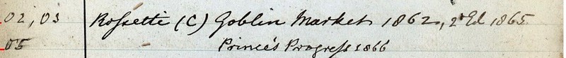
 As a research assistant for the Stainforth Library of Women’s Writing, one of my jobs has been to help transcribe and edit the entries in Stainforth’s manuscript into a Google spreadsheet—an activity that involves hours of staring at digitized versions of handwritten manuscript pages. The task may seem tedious—and, well, it is—but doing this kind of work has encouraged me to think about texts in new, more material ways. As a twenty-first-century reader, it’s often easy to take textual materiality for granted. Even though most of my reading consists of nineteenth-century British literature, most of it has been mediated through editors and publishers who are invested in making my reading experience easy. Consequently, it’s also easy to ignore font, spacing, and spelling when they aren’t distractingly irregular from what I normally read. However, Stainforth’s handwriting—sometimes clear, sometimes cramped and sloppy—always reminds me that my reading experience has been mediated and standardized while also inspiring me to consider other textual possibilities. I had one of these “textual materiality awareness” moments earlier this week reading Christina Rossetti’s famous poem Goblin Market (1862) in a class I’m taking on Nineteenth-Century Women’s Poetry. Since Rossetti’s poem is well-known for its ambiguously coded representation of women’s sexuality, we were naturally discussing some of the more evocative lines. For instance, when Laura gives in to the temptation of Goblin men’s fruits, Rossetti writes,
She never tasted such before, How should it cloy with length of use? She sucked and sucked and sucked the more Fruits which that unknown orchard bore; (lines 132-35)
As I sat staring at these lines with my present-day sensibilities, wondering how Rossetti’s contemporaries would’ve read these lines, I began to think about the long “s”—a character that resembles an “f” and replaces the “s” in the middle and at the beginning of words in printing and handwriting practices like Stainforth’s example in the manuscript excerpt above. Reading these lines with a long “s” would certainly offer a more explicit understanding of the poem. So, as any good digital humanist and archival editor would, I did a little research. With a quick search on HathiTrust’s Digital Library, I was able to find a digital copy of one of Goblin Market’s first prints. Skimming through the first pages of the book, I found the lines I was looking for on a page 8.
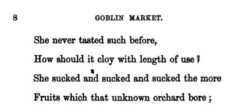
A little to my disappointment, the typeset for this book does not employ the long “s.” 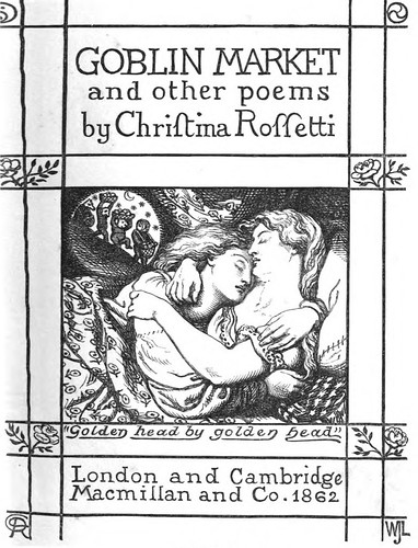
However, my perusal also taught me that Dante Gabriel Rossetti designed the title page for this book (pictured right). And wouldn’t you know it, there’s the long “s” in Christina Rossetti’s name. Although the long “s” in the title page doesn’t evoke the sort of explicit reading that it would in the poem’s typeface, it does let us know that mid-century Victorian readers were more familiar with this technique than we are today; and Rossetti’s first readerswould have been reminded of the similarities between f/s just a few pages before reading this juicy (pun intended) poem. So while transcribing a nineteenth-century manuscript page-by-page has resulted in a fair share of squinting at my computer screen, it’s also challenged me to think about texts materially to gain new insights and helped me practice research skills to find answers. Stainforth’s library is certainly a wealth of sources for women’s writing, and that’s only one of its benefits. Spending time in this digital archive definitely has the potential to teach us new things.